Introduction
At printMe1.com, we've seen our fair share of PDFs. Good ones, bad ones, and everything in between. Our site and most print sites require them. Ever wonder why that is?
PDF stands for Portable Document Format and was created to make it easy to share files that will look the same regardless of the printer or screen device. PDF's are difficult to change once created too. A user of the file is likely not the creator of the file, and it's a way to lock the content so it's presented the way it was intended by the PDF creator. This is very important for printing. All design and word processing applications can export files as PDF's. If you are someone who designs, writes, or creates PDF's, we want to share our favorite design tips for PDF's intended for print on demand services.
First, print on demand (POD) refers to printing that doesn't require extensive set-up and offers economical capabilities to print in low volumes. Digital printing technologies dramatically reduce set up costs and allow for print quantities as low as a single print with minimal upfront costs. POD can mean just printing something on your desktop printer, but also can mean something like printing a book at a commercial print shop or printing service.
If you're new to printMe1.com, well that's us! We've invested in environmentally friendly digital printing equipment and our easy to use website makes it a breeze to print PDF's in low quantities, bind them in a simple book format, and ship anywhere in the US.
And while most users of our site are people who were given a PDF and need it to be printed, bound, and shipped, if you are one of those very special people who creates PDF's, this article is definitely for you. We work with creators in education who create textbooks and Open Educational Resources (OER), creators in business who create manuals, and creators in personal improvement who create diet and exercise books, and even home users who write books on a topics that are important to them and want to share them with friends and family.
Key questions to ask when designing your PDF's for print on demand that will be printed in a book format are: Which fonts should be used? What size page should I design for? How much of a margin is best for my binding? What image resolution is needed for my images? And especially, how do I design for double sided printing?
We print, bind, & ship PDF's daily, so read on as we dive in on these questions from our experience with POD.
Tips for Designing for Print On Demand (POD)

So, where to start when designing a PDF for print?
Everyone has their preferred word processing or design application to start with. Adobe Indesign, Quark Express, and PressBooks for OER are great design applications for book creation, but common word processing applications can be used if they fit your content and you don't have access to more book specific software. Common word processing applications have limited ability to set type in text blocks, but if you don't have a lot of images, and your usual text block is a page of US Letter sized paper, then that can work for simple PDF's.
There are some things to consider in your document's layout that are often overlooked when it comes to the print version. Things like font selection, page size, margins, image resolution, and designing for double-sided printing are the main things that deserve extra consideration if you are planning a document for print on demand.
Before we move on, let's discuss some print terminology. When we write about book formatting, a page is referring to a side of print. A blank page is also a blank side of print. A sheet of paper used in a book has two pages on it, a front and back side. Just avoid thinking that a page also means a sheet of paper and you'll be fine!
Tip 1: Double Sided Printing with Chapterization. Design your PDF for pages that turn!
We'll start with the most often overlooked book layout element missed by new PDF creators - designing for double sided printing.
When we think about what makes a print book actually look like a book, often we think of the more tangible things like the cover , feel, and the heft of it all rather than the inside layout. However, for any PDF that will be printed as a book, the inside layout is really important and the print version has additional considerations over the screen version.
From our experience, the design factor most often overlooked in PDF's that we see is the design does not account for double-sided printing. What does this mean?
Usually the design of the book is taking place on screen, distributed digitally, and probably used first as a PDF on screen, so it's easy to forget to proof how it will look on paper- when printed double sided!
When viewing a PDF on screen and scrolling with a mouse, each page of the PDF appears sequentially, so one page appears after the other. This undoubtably seems correct when there aren't any pages to turn. But when this kind of PDF is printed, the book's forward or title page prints on the back of the inside cover, Chapter 1 prints on the back page of the Table of contents. Everything is off kilter because something is missing.
The thing that's off kilter and missing is called "Chapterization" .
What is "Chapterization"?
Chapterization, at least from the point of view of printing, is the name of the process that ensures each new chapter of a book begins on the right hand side of the page.
If you look at a book with chapters, print is almost always on both sides of the sheet of paper, and new chapters always start on the right hand side of the book when opened. This requires a deliberate review and action by the designer.
To design a book to print with proper chapterization, as each chapter or section is finished, the designer needs to check if the last page of the chapter ended on an even or odd page number. In a book, odd page numbers appear on the right, and even page numbers on the left. If any chapter ends on an odd page number, that means a blank page needs to be added to be the even page number, so the subsequent chapter starts on the next odd number, and will therefore start on the right hand side of the book. New chapters and sections always start on the right hand side of a book.
Think of it this way. Each page in a book always has a front and a back page, and if you don't have content for the back, you just put in a blank page before the next new chapter begins (and remember to do it in the design stage!) Ever see pages with the words "this page intentionally left blank?" Those are usually pages added a designer for chapterization. You don't need to add those words, especially if the pages of the book are numbered, but if you want your PDF to look great when printed double sided, don't forget to add blanks where needed so it looks correct!
This is called "Chapterizing" in a nutshell. If you want your PDF to be bound and read like a book when printed double sided, let's take a look at key book elements to chapterize so your pages look great when turned!
Pro Tip: If you are designing a front cover, always add a page for the inside of the front cover, even if it's a blank! This is a common mistake we see in PDF's that are otherwise designed perfectly.
Expert level trivia: The mathematical concept to describe "evens and odds" is called "Parity". Odds are 1,3,5,7,9, etc. and Evens are 2,4,6,8, etc. The way we identify parity algorithmically in our website processes is that even numbers produce an integer when divided by 2. Odd numbers produce irrational numbers when divided by 2. Yes, we need to get out more!
Front Cover and Inside Front Cover
The front cover is hard to miss, isn't it? So if you have a front cover that is single sided, don't forget the inside front cover. This a big cause for chapterization issues we see because its so easy to miss. If the front cover is single sided, always add a blank after the front cover so the next section whether its a title page or a table of contents starts on the right hand side when printed double sided.
Many PDF's are designed assuming they will be read from a screen and are missing a blank page after the front cover and that causes the print version to have inconsistent or incorrect chapterization when printed double sided.
Front Matter
The "front matter" can be many different things based on your content. The preface, any preliminary pages, title page, forward, or more. Just make sure each section of front matter ends on an even page number, or is paired with a blank page if it's a single page section.
Many problems with chapterization in print are caused by not including a blank where needed with single page front matter.
Table of Contents
This layout element is necessary for textbooks, manuals, and other reference materials.
If you have a table of contents in your PDF, make sure it ends on even page number, or if it doesn't, just add a blank page after the last page of the table of contents.
Pro tip: Make sure your content is already chapterized before creating the table of contents.
Chapters
Yes, you guessed it! It's so important that all chapters should start on the right hand side, we're going to go over it again..
As we mentioned above, this is accomplished by making sure each chapter begins on an odd page number, and ends on an even page number. When you start the numbers, the 1st page of Chapter 1 is page 1. The back side of page 1 is page 2, etc. If your content for any chapter ends on an odd page number, then just add a blank page on the subsequent even numbered page to be the new last page of that chapter. Then the next chapter will begin on the right hand side. Easy!
Pro tip: If you use our free PDF Builder to combine PDF's into one file to print like a book, we have a Chapterization feature built into to the process a each file is added, along with features to overlay a new set of page numbers, a table of contents, and a new front cover.
Tip 2: Image Resolution
Images used in a print file need a higher resolution than screen images. Screen image resolution is quantified in pixels, and abbreviated sometimes to px. Printer resolution is based on dots per inch (DPI). Screen images are often at 72 dpi, but that resolution is not high enough for print. If the resolution is too low, the image will bitmap or look blurry when printed.
The other consideration is the resolution of the images should be not exceed the resolution capability of the printing device. Printing devices measure resolution in dots per inch (DPI).
Adding extremely high resolution files that far exceed the printing device's capability can cause issues with memory on the printing device without adding any improvement to the print quality, so if you have very high resolution images and plan to use a lot of images, it's best to reduce the resolution so the overall file size is not so large the PDF is difficult to transfer or print.
Our recommendation for print on demand at normal page sizes of US Letter or less is to use images at from 150 dpi to 300 dpi.
Tip 3: Font Selection
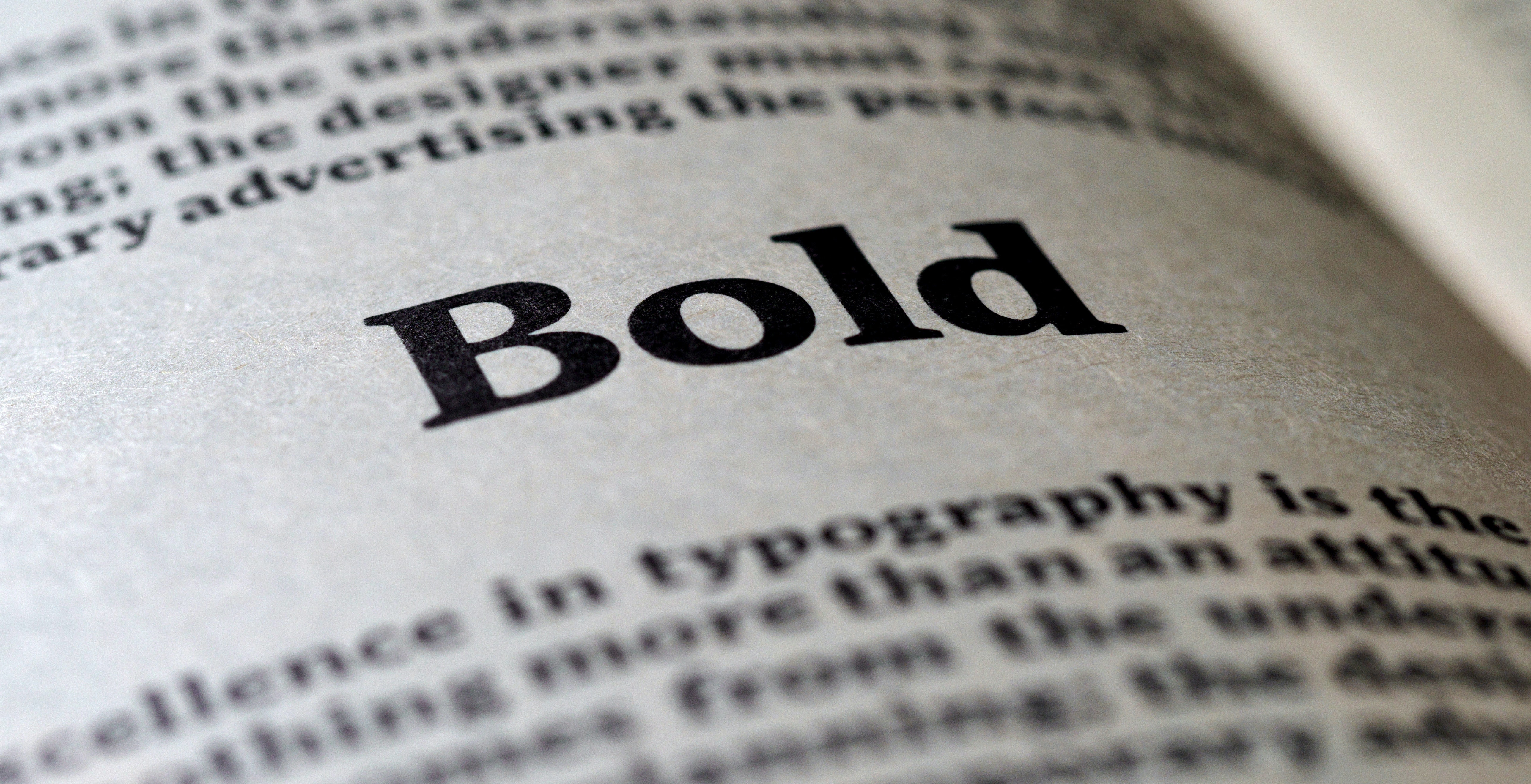
Fonts are to a book like a facial expression is to a face. Fonts can communicate a tone for your book. They can look forceful, glamorous, moderate, clear, delicate, strong, and more.
The font choice is important consideration because it connects your reader and your book's content. Fonts can set a tone for the reader's experience but at the same time, if you are designing the content to be printed, there are some considerations for your font choice that can be made from the start.
When choosing a font for print, consider fonts that are easy to read and are not comprised of thin or narrow elements in their construction. This is a subject that can be a book all by itself, but for now we recommend using standard fonts for standard content, but a little tweak to set you apart is also fine. Standard fonts not restricted by copyright are embedded into PDFs and go along with the PDF file. There are custom fonts out there that can make your PDF look unique but don't embed in the PDF, causing problems when the file is opened on a device or used on a printer that doesn't have the custom font. When a custom font goes to a printer that does not have the custom font, a substitution or error can occur.
Pro Tip: Use a standard font that came with your device to ensure the font works on other devices or printers.
Tip 4: Page size. What choices are there really?
The size of the page impacts how the book will be used. Smaller page sizes are easier to carry but require smaller type which is more difficult to read and have fewer binding options. Larger page sizes like US Letter especially allow for larger type sizes that are easier to read, more room to write in, and can be bound using a variety of binding types.
Smaller page sizes have names like Digest (5.5×8.5in), US Trade (6x9in), Duodecimo (5×7.75in,) and Pocket (4.25x7in), but these smaller sizes don't run through printing devices generally, so they are difficult to find in sheets at the finished size. These smaller sizes originate from printing on larger sheets, then cutting the pages down to the finished size.
Larger page sizes found commonly in the US are US Letter (8.5"x11"),Legal (8.5" x 14"), Tabloid (11x17"), and Oversize Tabloid (12" x 18"). These larger sizes can be purchased in reams like US Letter, but some home printers are not able to print larger than an 8.5" width.
If you are designing something that will be used frequently like a textbook or manual, a larger size is beneficial to allow for larger type and allow extra room if needed for note taking. For this reason we recommend designing for US Letter. This is the standard 8 1/2" x 11" sheet size in the US & Canada and found in homes, schools, offices, and print shops.
If you are outside of the US & Canada, the equivalent standard to US Letter is A4, and is 8-1/4 x 11-3/4 (21 cm x 29.7cm). A4 is skinnier and taller than US Letter. If you primarily have an international user base, it is better to design for A4, and in the US it can be printed to fit when printed on US Letter. This doesnt mean the image will be exactly scaled down 1:1, but instead the height will be reduced while keeping the width as wide as can be printed, so the print area is maximized. This might look, a little out of scale but will be readable. The alternate is to not change the scale, but it will make the text smaller than when printing to fit . printMe1.com automatically prints to fit.
Pro Tip: if you are primarily creating your PDF for an audience in the US or Canada, designing for US Letter (8 1/2" x 11") is recommended. BTW- printMe1.com only prints on US Letter.
Tip 5: Let's talk binding and POD!
If you expect your PDF to have a lot of pages, now's the time to think about binding so your PDF can be used effectively when printed and bound.
We've written a lot about the comprehension benefits experienced when reading from print vs screens before, and also students prefer to study from print when given the choice, so if your content has a high page count, we highly recommend to plan for print and thinking early about binding options early is a good idea.
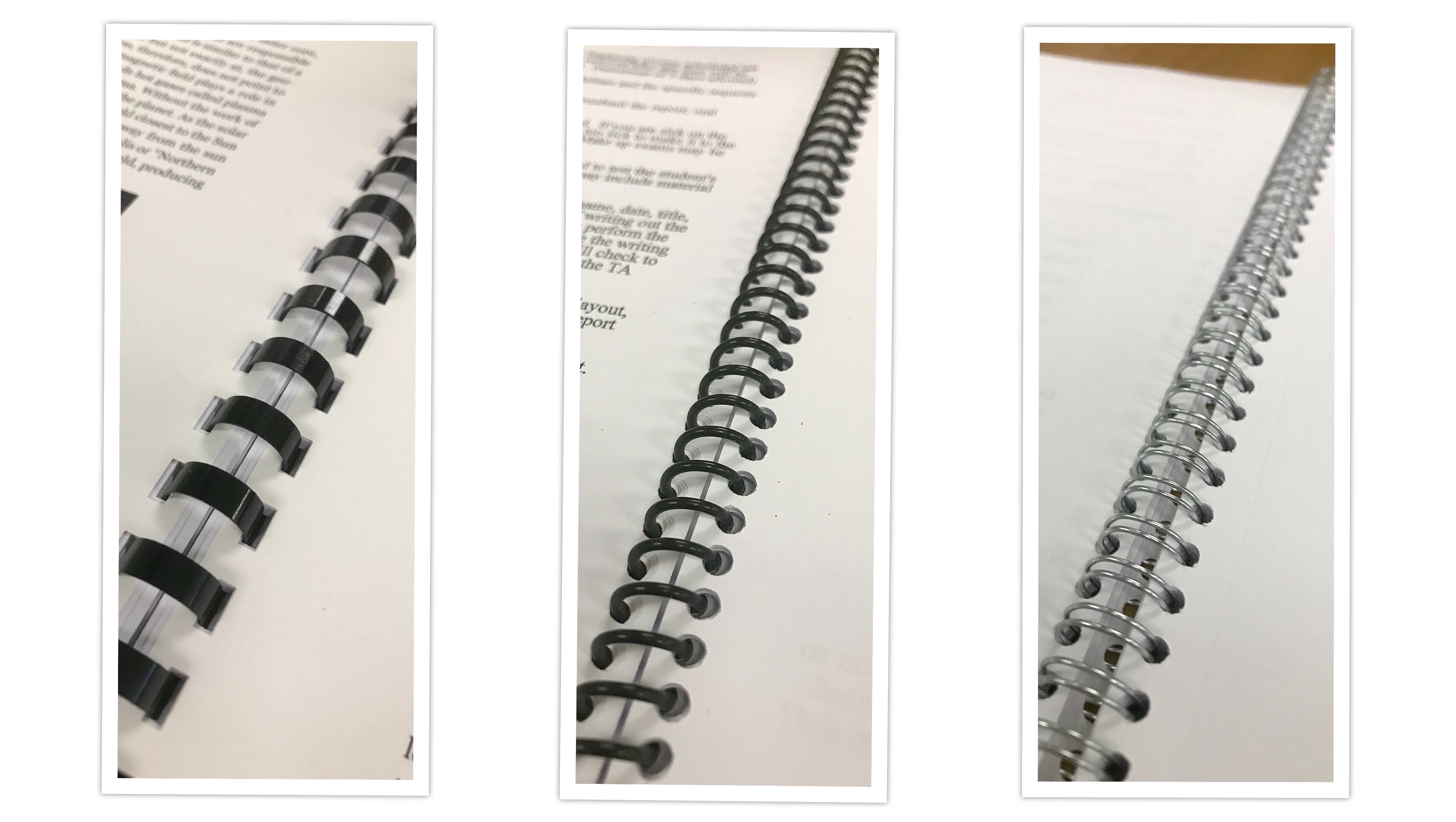
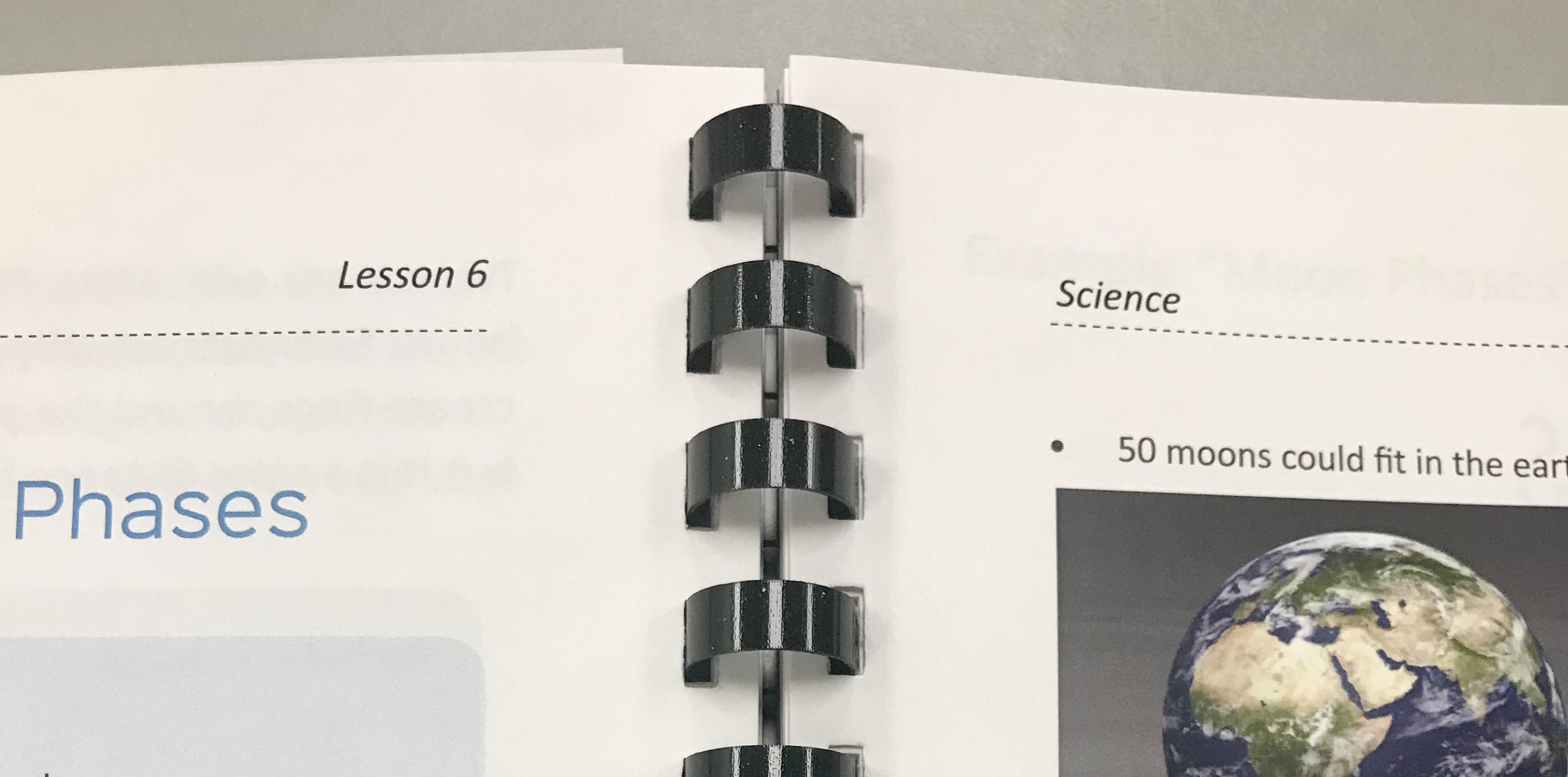
The common binding options found in commercial print shops are relatively consistent: Plastic Coil, Wire-o, Velo, GBC Comb. We often call these "Mechanical Bindings" because the binding itself is something that is attached to the page using a comb that locks or coils into place. These are very easy to find, economical, and easy to plan for. These bindings are all designed to be used on the long edge of an 8.5" x 11" US Letter sized sheet of paper, which is the sheet size found in homes, schools, offices, and print shops.
PDF's with extremely high page counts (over 400 sheets/800 pages) can be punched for use in a 3 hole binder, often referred to as 3 hole punch (3HP). Low page count PDF's can be stapled (under 30 sheets/60 pages).
An example of a non-mechanical binding is Perfect Binding. This is a process that uses glue to attach the pages to a cover that is larger than the interior sheets, then uses a commercial guillotine cutter to chop off the excess around the 3 non-binding edges to make everything look uniform. The cover needs to be designed for a sheet size that is large enough to wrap the interior sheets and the interior layout needs to account for larger margins so the exterior edges can be trimmed when the cover is cut down. This adds some complexity to the design and print production process. The cover's spine width needs to vary based on the thickness of the sheets to be wrapped, which then means the design of the print on the spine needs to fit this width. Usually if you are designing for Perfect Binding, your cover art needs to be a file separated from the PDF so it can be printed on a larger size sheet than the interior pages. This makes it difficult to share in one file.
We favor designing POD for the mechanical options due to their strength, versatility, and ubiquity, especially for group uses, but perfect binding is very professional and looks good on a retail shelf.
A user's binding choice depends on how, where, and when the book will be used. Class materials that might be printed either on a desktop printer or with POD service, we recommend designing for mechanical bindings like GBC Comb, Plastic Coil, or Wire-o.
Pro Tip: Design for standard mechanical bindings so the PDF can be printed anywhere by anyone- and still look great!
Tip 6: Margins for POD
What margins are best when designing for print and how important are they? If margins are too big, not enough of the page is used and causes the book to have more pages than it should, which then adds to the printing & shipping costs. But if the margins are too small, that can cause problems as well.
Most digital print devices are not able to print close to the edge of the sheet, so leaving at least a small amount of space as an exterior margin around all sides ensures all of the content will make it to the paper. But there is more to consider when it comes to determining the margin.
The margin closest to the binding is called the gutter. Gutter margins need to have enough space to allow room for the binding. The gutter margin is greater than the other margins to allow the visible remaining inside margin next to the binding to be the same size as the margin of the three other exterior edges. This is so the page content will appear to be centered on the page as defined by the 3 exterior edges, and the visible margin before the binding edge.
The type of binding and number of pages are factors in the amount of space required in determining the size of the gutter and the consistency. If the binding allows the book to lay flat, then the gutter area can be the same on every page. If the binding does not allow the book to lay flat, then if the book is thick, some extra gutter should gradually be added so the text makes it out of the curve of the gutter. In cases where there are a lot of pages in a book and there isn't enough gutter, then the beginning or end of each sentence might hidden in thick curve of the pages near the binding edge.
Lay flat bindings most common are GBC Comb, Plastic Coil, Wire-o, and 3 Hole Punch (3HP). Lay flat bindings are easier to write in, and can be opened pages can be used while folded open, so they only take up half as much space while being used. Non- Lay flat bindings are Velo binding and Perfect Binding.
Here are our suggested margins for digital print on demand:
Front Cover-
This assumes the cover image does not require a full bleed, and is being printed on demand using the same size paper as the interior pages. Less of a margin is needed on the front cover to allow for artwork.
Binding edge: 3/8". Please note cover art will be punched through. If you do not wish to have cover art punched through, please use the binding edge of 1/2" for GBC Comb, Plastic Coil, and Wire-o. 9/16" for three hole punch (3HP).
Other edges: The absolute minimum print margins for digital printing are 3/16" except for the lead edge, which is is greater at 1/4". The minimum margin on all sides is 1/4" for print to occur within, without adding extra margin for the binding gutter. See interior pages for the recommended margin to account for the binding gutter.
Pro Tip for Front Cover design: If you have great cover art, definitely use that, but when in doubt use a white background.
Interior Pages-
Standard Setup for Ease of Use
1/2" on the outside, non-binding edges . If you are designing for 3HP or Velo binding, then add an extra 1/8" on the inside, binding edge to allow for the binding area.
Advanced Setup for Maximized Space
1/4" on the outside, non-binding edges, then an extra ¼" on the inside, binding edge for bindings such as GBC, Plastic Coil, and Wire-o. If designing for 3HP or velo binding, increase the ¼" on the bindng edge to 3/8".
If you use something like velo, and if your document is very thick, the pages in the middle of the book benefit from extra margin. You may prefer to add an extra ¼ in on the interior edge.
Margins are important because they provide a consistent area to signal when to go to the start of the next new sentence. Margins also provide an area to hold the page while reading, and of course write in some notes.
Pro Tip for easiest setup: Making all margins 9/16" will eliminate the need for different margin settings and will work with all bindings.
What if I want Single-Sided Pages?
We recognize there are times when multipage PDF's need to be printed single-sided, so we now offer a single sided print option.
Conclusion
Most books today are created in applications that allow the document to be shared or exported in a PDF format. PDF's can look good on screen when each page of the book appears sequentially page after page, but if the PDF is expected to be printed double sided, the layout needs to account for chapterization. This is accomplished by adding blank pages where necessary to allow each new chapter or section to appear on the right hand side of an open book.
Choosing an appropriate font, and using appropriate image sizes are other factors to consider when designing a PDF to be printed on demand. Thin and narrow fonts can be difficult to read, while balanced and clear fonts are easier to read. Using images that are high resolution look better, but should not exceed the resolution capability of the printer or will be unnecessarily large files and sometimes difficult to print.
Designing your page size for US Letter (8 1/2" x 11") allows it to be printed more easily, and also fits binding types like GBC, Plastic Coil, Wire-o, and Velo binding that are commonly found in offices, schools, and most print shops in the US and Canada.
Print on demand processes require margins to allow space for the binding, and area to center the content within. The margin for the interior edge is called the gutter, and can vary based on the thickness of the book, and type of binding used.
With these tips, it's easy to design a PDF that will look great when printed and bound to be used in a book format with a print on demand service.
If you have a place to print your PDF's, that's great! But if not, we hope you check out printMe1.com for simple print on demand, and also our PDF Hosting features to help offer a print option for your PDF to your students, clients, group or user base.


![Single-Sided PDF Printing [Updated 4-8-24]](http://public/images/530/blog/upload/25b15134-header.jpeg)


![PDF's of enacted US Laws, Federal Court, and other US publications reformatted for Easy-to-Read Printing in US Letter Formats- Free downloads [Updated 8/15/25]](http://public/images/530/blog/upload/5aed875-abraham-lincoln-memorial-1920x1080.jpg)


